How my decorating style has changed
April 20, 2020
Share this
Hey all! I hope you are doing well! We are almost exactly at two and a half years in our "new" home and it's had me thinking about how much my style has changed since we lived in the old house.
My decor style is always morphing over time, but a new space gave me free rein to change things up a bit. During our time in this home, I've noticed how my decorating has changed quite a bit.
Starting fresh will do that I guess?
Let me be clear -- I don't think either of the looks is better than the other, I just think it's fun to look back and see how my style has changed!
If you have been around for awhile, you know that we did a big renovation in our old house, in segments, that started about six years ago. The first part was taking down a wall in our family room to open up the space -- that area in the corner used to be my office:
This post may contain affiliate links for your convenience.
See my policies and disclosure page for more information.
This was by far the best decision we made in that house! I gave us SO much more space and allowed us to make our kitchen bigger as well.
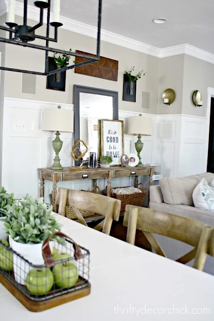
As far as my decorating, I look back and notice that it was more farmhouse style then. I sold and donated SO MUCH stuff shortly after moving in here, and many of the items in these photos have gone to loving homes. :)
Farmhouse decor hit it's peak about that time, so I was right on trend...for once! Ha!
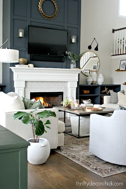
In this house I've gone a little more moody with the paint colors, and have pared down the accessories and art quite a bit:
Which is funny, because we have more open space here, and probably more wall space?
But from the start I wanted to use less than before:
I think it was because we had lived in the tiny hotel room for so long in between houses. (Three humans and three animals in 300 square feet for nine weeks.) When we got in here I had this strong desire to have less stuff around us.
I figured over time, I'd want to add more and more, but I haven't. I'm still perfectly happy with living with less decor:
I used to feel like every wall had to have something on it...but it's been nice to let spaces breath and just BE here.
Goodness, I loved this shiplap bathroom so much! And I worked SO hard on it!:
I still love it! I used way more color back then...who knew aqua and red would look so good together? (My inspiration came from our son's artwork that hung in there.)
I think it's my desire for less stuff or distraction now, maybe because I'm getting older. But I went way more dramatic and a bit more modern with our current powder room:
It's hard to tell here, but the dark peel and stick wallpaper has gold flecks throughout that is a more sophisticated contrast to the traditional board and batten.
This simpler wall trim treatment felt right here -- and it was way less work than the powder room with shiplap and board and batten in the old house!
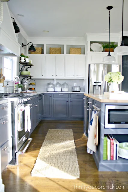
I'm not sure I've worked harder on a space (or been prouder) than our kitchen renovation in the old house! I keep going back and forth on adding another wood hood -- this one looked so good!:
I also loved the contrast of those darker lower cabinets and white uppers.
I chose farmhouse style for the lights and accessories, as well as the backsplash. I went with a shiplap cement board instead of tile for budget reasons (and it was MUCH easier to install):
Subway tile has been around forever, and definitely fits in with a farmhouse look. I went with a slightly more modern take on it in the new house with a darker grout:
The tile also has a beautiful wavy texture to it that gives it a little more interest than regular subway.
I had dreamt of those brass and black pendant lights for YEARS and was so thrilled to incorporate them into our new kitchen! Over time I've added more black touches with the stools and black painted door to tie into those.
I can't let go of some of my farmhouse touches in here though -- that dinner bell and the cutting boards will always stay. ;)
I'm always going back and forth on painting our island a darker color...the need for contrast is deep in my bones. But with darker colors in the dining area and family room, I wonder if it will be too much. Time will tell!
The window seat we installed in the old kitchen was a dream come true for me:
The lights definitely added that farmhouse feel as well.
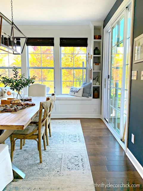
This time, I built some small bookcases on the window seat and a more modern light fixture:
Now that I've had a few of them, I don't think I could live in a house without a window seat! :)
Here's another example of how I've gotten a little more daring with paint colors but also toned down the accessories. Here's a look at the DIY bookcases I built in our old dining room turned library:
I boxed up ALLLL of that decor...and then ended up not using so much of it.
When I built similar bookcases in my office, I went with a moody dark green and pared down the accessories quite a bit:
I love that they let the pretty wallpaper that lines the back shine!
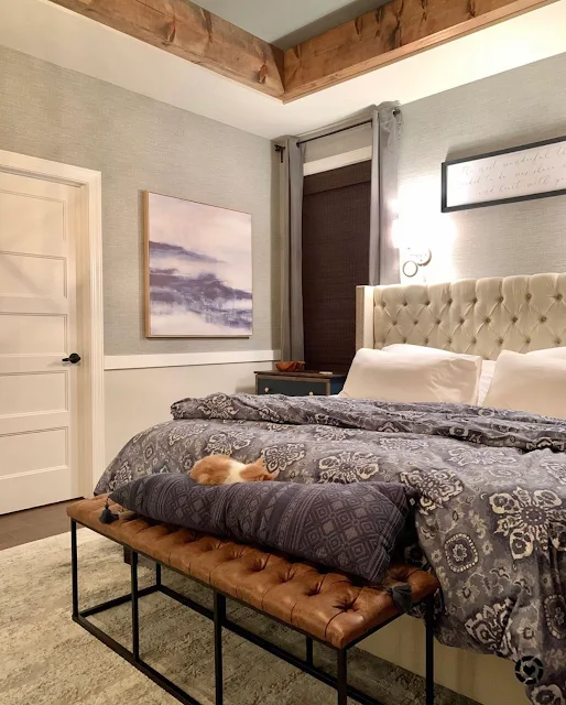
One room that I've keep very similar is our master bedroom. Our old one was large, but SO incredibly cozy too:
The mix of dark and light gray walls made it feel so warm, especially at night:
This time I'm sticking with the gray -- I started by adding the wood beams around the tray ceiling and painting it dark:
And then continued by hanging faux grasscloth wallpaper. I LOVE it so much!
Wallpaper has been another difference in this house. I have used it in four rooms here and never used it in the old house!
Next up is painting that chair rail and the walls below. Overall, this room is one that is pretty similar as far as the decor:
I can't wait to get more done in there! It's going to be so lovely.
Darker accents, less stuff and less farmhouse decor are the changes I've noticed most since moving into this house. It's been an absolute blast decorating this home, and I'm so glad you join me during the process!
See more of our home here. To shop items in our home, click here! Never miss a post by signing up to get posts via email.










Your style has always been so nice though! ❤️✨
ReplyDeleteCharmaine Ng | Architecture & Lifestyle Blog
http://charmainenyw.com
I can't believe it's been 2.5 years in the new house! That seems crazy to me - I've been following a long time for sure!
ReplyDelete