First Look: The New Guest Room Tour!
February 13, 2020
Share this
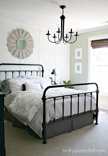
I did some small updates to our guest room this week that I'm sharing with you today! I found a few new items but this room is mostly made up of items we've used before. It turned out so pretty, I had to show you. :)
I don't think I've ever shared this room in our new house! Maybe one photo? So I'm excited to share it with you today.
You can take a tour of our old guest room here, and you'll see that a lot of the pieces are the same:
My decor style has never been full out farmhouse, but our old house I definitely had touches of it, especially in this room!
I haven't leaned farmhouse in our new home, but there's something about this room that feels so cozy and sweet with it! I adore that metal bed so I went from there with the little updates I made this week.
I'll share all the details shortly, but here's your first look at our guest room in this house:
This post may contain affiliate links for your convenience.
See my policies and disclosure page for more information.
The first update was the light -- I bought it months ago and just put it up this week. I have said MANY times over the years how much I despise hanging lights. The electrical part is easy -- it's all the little details with the light that are a major pain.
I hate it with a deep, burning passion. But I got it up! 👏
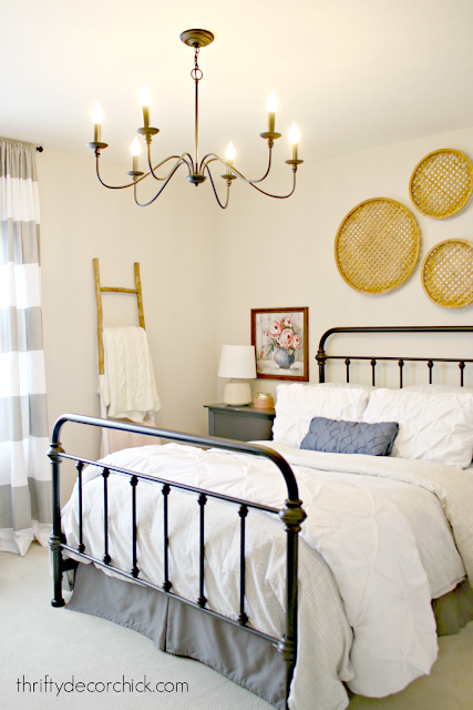
It's a six light black chandelier and I absolutley love how it looks in here!:
I'm definitely adding a dimmer -- it's bright even with 40 watt bulbs. I got it for $110 and it's on sale for just over that right now. I love how it ties in with the bed frame!
Pretty much all of the new decor was from At Home. I found that knock off Anthropologie blanket ladder there. It looks identical to their version!
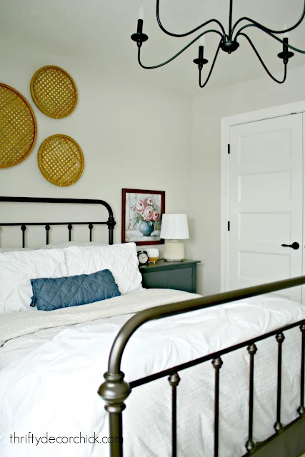
I found these new nightstands on clearance. I totally lucked out when I found two of the same ones!:
I plan to find some new knobs at some point to soften them up just a bit.
I had cute black lamps in here before, but they didn't give off much light. I found these pretty lamps at At Home as well and really love the texture.
Our bedrooms in this house are pretty small, but this one is a bit more spacious than our son's room. This closet is a standard size but I love having the double doors instead of sliders:
It feels bigger because I can access the whole thing at once.
The baskets on the wall used to hang on our stair wall. I almost sold them...so glad I waited!:
They fit in perfectly with the cozy farmhouse vibe.
One of my favorite furniture finds ever sits on the other side of the room:
I found beauty on Craigslist years ago and absolutely love it. I later added the hardware and I think it makes the piece.
We had the large mirror and lamp, and I found the tray at HomeGoods:
I plan to add more little details over time that will make our guests feel even more at home.
The bench under the windows was from the old house but I hope to find a chair for that corner instead:
The next purchase for this room will be a new mattress -- I'm not even gonna tell you how old this one is. It's bad. 😆
It wasn't until after I hung the floral art prints that I realized I had another option in the closet. They used to hang in our master bedroom and I think they'd be lovely in here too!
Here's one propped up so you can see how it would look:
The colors are perfect! But I do love the variety of colors the new art brings in.
And and as our sweet 13-year-old told me, the new ones are "cozier" so they work better. :) Which ones are your favorites? New or old?:
For now, this space is "done" -- but I know I'll add more detail/changes over time. You know me. :)
If I forgot to mention any details let me know! The paint color is Agreeable Gray by Sherwin-Williams and it's what we've used throughout the house. Here are some of the items in this space if you're interested (you can hit the arrow to see them all):
See more of our home here. To shop items in our home, click here! Never miss a post by signing up to get posts via email.


I like the pop of color the new ones bring into the room. I vote new.
ReplyDeleteSame!
DeleteLovely. I am also using Agreeable Gray for my house after seeing it on your blog. It's perfect, and Sherwin Williams paint is the best I've ever used.
ReplyDeleteEither works great, but I prefer the new I think. The small pop of color is nice...other makes it all really kind of monochromatic. My two cents!
ReplyDeleteLooks beautiful! What white did you use for your trim? Looks perfect with agreeable gray. I have Anew Gray in my home and need to repaint my trim and doors. Thanks.
ReplyDeleteI asked for Pure White but when I use that it doesn't match. Ours is a bit creamier. I have contacted our builder to see what they used!
DeleteLovely room. I like the found-in-closet art a lot, but of course what your son likes best is more important! And did you really say 13!? Chrissy
ReplyDeleteI prefer the ones from the closet. The new one has a hint of the 80s or 90s...more old country cottage than modern farmhouse. There's nothing wrong with that but I lived with it for too long and it's just not my personal taste. Use what you love.
ReplyDeleteForgot to say how much I love everything else!
ReplyDeleteBoth are pretty but enjoy the new one's pop of color.
ReplyDeletelove everything, my vote is for the old ones, a bit softer and pulls it all together?
ReplyDeleteI have been looking to do the same thing with my closet doors.
ReplyDeleteCould you please give the info. on where you purchased the ones you have?
Our builder provided them, sorry I don't a source for those!
DeleteThanks for responding... the search continues. My contractor said we wouldn't be able to do it because the doors don't have anything to hang onto in the middle. At least I have a photo to show him now that it is possible. :)
DeleteSooo very pretty! Can you please share the source of the new floral art?
ReplyDelete