Indy Home a Rama luxury home tour
November 05, 2019
Share this
Hello my friends! I'm back today with the final installment from this year's Indy Home-A-Rama. You can see the first luxury home tour (with one of my favorite homes) and the second modern home tour (I loved it so much it got it's own post) if you missed any of those!
Of these last two, one was my least favorite and the other I really loved because of the great room. It was awesome! I don't have many pics of the fourth home to share but I did love the front porch!:
This home was built and designed by Whicker Construction
I mean, really love it! It was so grand and I loved the double porches on either side.
This little office/homework room was really cool as well. I liked that dark blue gray color on the cabinets:
I mentioned in the first tour that there were quite a few trends I noticed throughout each home, and the deep cabinet color and wallpaper in this room were two of them.
It's funny because this kitchen was my least favorite, but was still really beautiful!:
I think I would have loved it more if they had all open shelves on top or all cabinets...it felt busy to me this way.
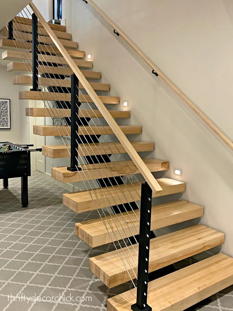
The stairs to the basement were SUPER cool -- open stairs always kind of freak me out, but these didn't have a huge opening:
I really loved the modern feel, especially for a basement.
The fifth home had the great room I loved. The exterior was probably my least favorite, but I did love those black windows!:
This home was built by Gradison Design Build
The basement walls were covered with this vertical paneling -- the color and height helped it to feel more contemporary:
I loved this little bar/nook! The shelves in front of the mirror were a nice touch and the sconces lining the wall were fun:
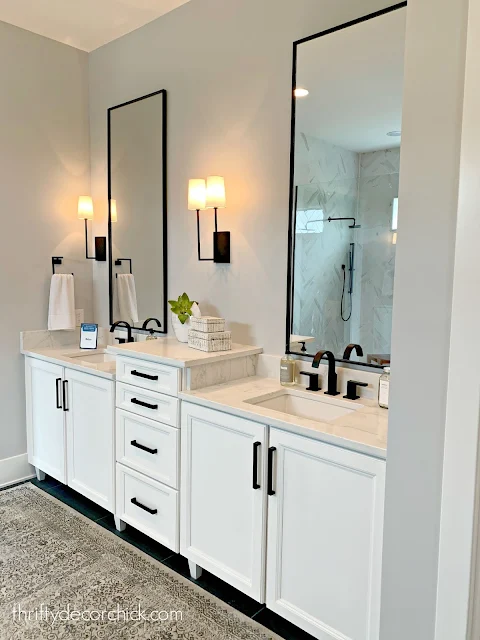
I really loved the white bathroom with these large black framed mirrors:
I always wonder if sconces in the bathroom would be enough light. They sure are pretty though!
Another gray bedroom -- told you they were everywhere!:
This cool wall treatment in the stairway paired perfectly with the modern railings:
You know how much I love a window seat!:
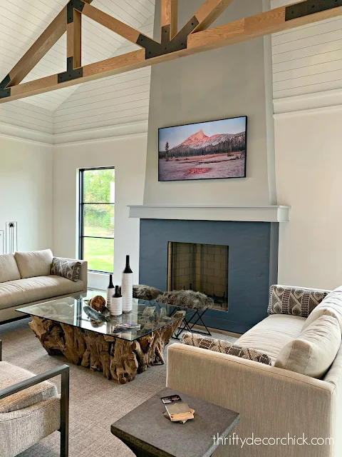
This great room was SO awesome -- so spacious! I loved the planked ceiling and wood beams:
This room was HUGE! The kitchen was mostly gray as well, but the open feel kept it light and bright:
This room was pretty sparse -- some plants or wood cutting boards on the counters would have warmed it up.
The laundry room was so pretty -- it felt a little "sweeter" than the rest of the house but I loved the cabinet color and the tile:
I'm off to work on the master bedroom makeover! I wanted to finish it up before November 1 -- I'm just a little behind. :)
See more of our home here. To shop items in our home, click here! Never miss a post by signing up to get posts via email.


Wow, I love the entrance of the home! It's beautiful! As with the interiors, of course! ❤️✨
ReplyDeleteCharmaine Ng | Architecture & Lifestyle Blog
http://charmainenyw.com