Modern home tour with beautiful neutral accents
October 15, 2019
Share this
Hello there! I'm back with another home tour from our local Home-A-Rama in Indy. This home was one of my very favorites!
I took a ton of photos of this one (didn't realize till I started going through them all) so I'm dedicating this post to one house. I'll finish it up the tours with the last two houses in the next week or so.
I shared the decor trends I noticed at this year's event in my last post -- see the first two luxury house tours here! Those trends definitely carried through this home too. I had two favorites on the tour (one I shared in the last post) and this one!:
The builder of this home is Executive Homes.
When you walk in the staircase was a stunner:
I love the windows in the stairway!
The basement was very cool, but I especially loved this TV. How cool is that? You can watch numerous shows at one time:
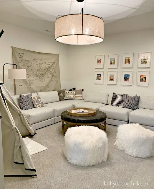
This kid space in the basement was fun too:
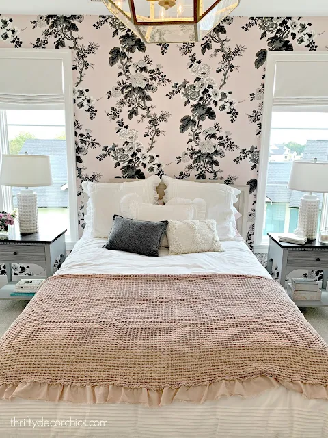
Remember how I mentioned there was a ton of wallpaper? It was used a lot on accent walls behind beds:
I loved this little nook they turned into a homework area with doors:
Not sure it would be used much -- but it would be a quiet, designated spot closed off for concentration!
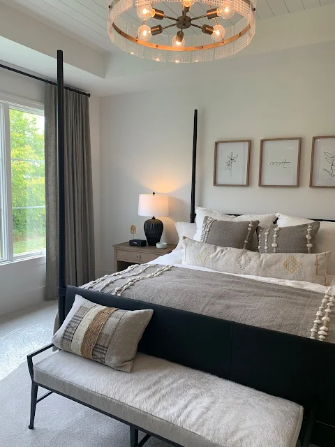
I also mentioned last time how much gray was used -- I know many want of you don't love it, but I think it's going to be trendy in some form or fashion for a long time.
It was used in the textiles throughout this bedroom:
I thought this was a brilliant idea -- if you have a big closet but still don't have a ton of room in the middle for a table, using a skinny sofa table instead is super smart:
I loved the gray walls in the bedrooms -- they all felt so cozy!:
This bathroom tile was so pretty! I loved it with the dark gray vanity:
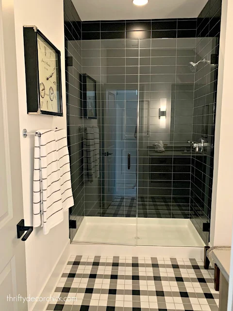
This bathroom layout reminded me of ours -- if only there was a way to paint our tub black. ;)
This plaid tile was so fun too! I don't usually love the stacked subway tile, but I quite liked it in a couple houses on this tour. I think it was because they were combined with more traditional accents:
I don't think I'll ever fall out of love with a light gray and wood tones. They are a lovely combination!:
The trim in this room was so simple, but I loved it. I broke up the walls just enough:
This was one side of the office on the main level -- you guessed it! More gray! 😂 I love how the trim is the same color as the walls:
Remember my DIY photo shelves? That's basically what they did here, but keeping them the same paint color keeps it soothing. And now that I see all of these spaces all together, I realize there was a TON of gray in this house. 😂 It really didn't feel like that as I walked through though. (I'm not sharing a lot of the house, there were plenty of rooms without it.)
The family room and kitchen in this house were my favorites. The family room was SO pretty and serene, but also cozy feeling:
I just loved the neutral, pretty touches in these rooms. It all worked together so beautifully:
The kitchen was an absolute stunner. That wood vent hood!:
I loved the stone on the backsplash. The more I see this done the more I love it:
The cabinets look gray in some of these photos, but in real life they were a light taupe color. It is a very trendy cabinet color right now:
Gorgeous right? It was one of my favorite kitchens by far!
The outdoor spaces weren't quite as elaborate this year, but I did take a picture of this because I thought it was so doable:
It was just pea gravel with pavers around the edge -- the square shape gives it a more modern feel. You could easily add a DIY fire pit like we did on the patio! :)
There you go! My second favorite house! Do you have a favorite room in this home? I'll share the remaining homes soon! Don't forget to visit the first home tours if you missed them.
See more of our home here. To shop items in our home, click here! Never miss a post by signing up to get posts via email.


Do you know what the exterior paint colors are on this house?
ReplyDeleteA stunner for sure! I love the neutral tones – I'm drawn to them myself! ❤️✨
ReplyDeleteCharmaine Ng | Architecture & Lifestyle Blog
http://charmainenyw.com
Did the builder list paint colors? Loving the taupe cabinets!
ReplyDelete