One of my favorite luxury home tours
October 04, 2019
Share this
Hello there! It's that time again -- time to share some beautiful houses at our local Home-A-Rama in Indy. I finally got to the show yesterday (it's going through this weekend) and the homes did not disappoint!
As always, I'm sharing some of my favorite spaces in the homes with you. There were five houses in the tour and I'm sharing the first two today. One of my favorites was in this group, and another favorite I'll share next week.
I noticed a few trends overall in the decor and design worth noting (for my fellow decor nuts):
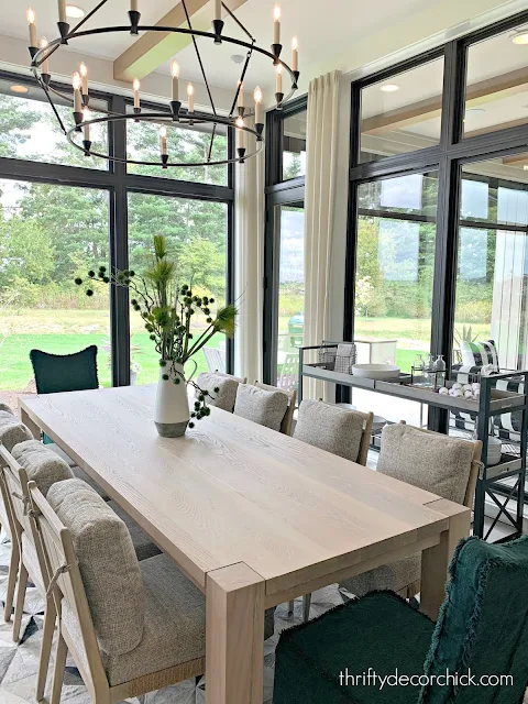
- Black windows were definitely the trend and I loved it. I always love the look! All but one home had black trimmed windows.
- The color gray is not going anywhere in design! It was everywhere and I really loved it. Doors, walls, cabinets -- you name it! LOTS of gray bedrooms. I know many are tired of the gray trend, but I still really love the warm, cozy vibe of gray walls in a room.
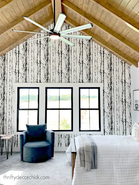
- Wallpaper was everywhere and I LOVE that too! I've used wallpaper a few times in our home -- it is back in a BIG way! It was used often as an accent wall behind beds, in bathrooms, mud rooms...all over!
- Most of the kitchens did not have white cabinets. Out of the five kitchens only one had white and it was my least favorite. Most were wood or deeper colors, especially in basement kitchenettes, bars and bathrooms. LOTS of gray and dark blue with brass hardware -- love!
Let's take a tour, shall we? The first home was one of my top two favorites!:
Built by: Wedgewood Building Company
What I loved about this home:
- The gray/wood cabinets throughout as well as the darker cabinets in the basement
- The pretty, large scale peony wallpaper in a bathroom
- The master bathroom with it's lovely tile wall and beautiful symmetry
- The pretty wood kitchen cabinets and the cut out area for the stovetop -- just gorgeous!
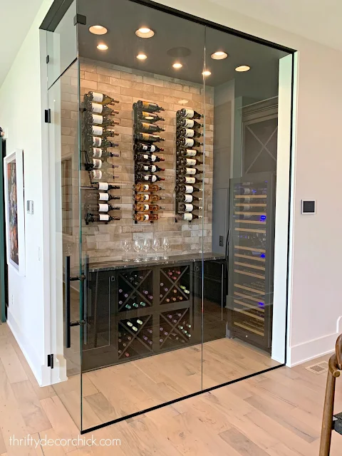
- The glass wine closet in the kitchen...hello. Yes.
- Brick tile in the mud room
It's hard to tell it here, but that metal sheeting in the cabinets looks like bamboo -- it was SO SO pretty and I'm obsessed with it.
Beautiful right? The staircase was awesome too -- you can see a bit of it in the photo above. (Similar design as my fireplace reveal this week -- thanks for your kind comments!)
The second home on the tour had a pretty Cape Cod feel on the exterior:
Built by: Viewegh and Associates
This one had some funkier touches here and there and I wasn't a big fan of the kitchen, but there were many spaces that I really loved!
My favorites in this home:
- The pitched wood ceiling in a bedroom with birch wallpaper (again, love the symmetry)'
- The gorgeous master bathroom with wood beams
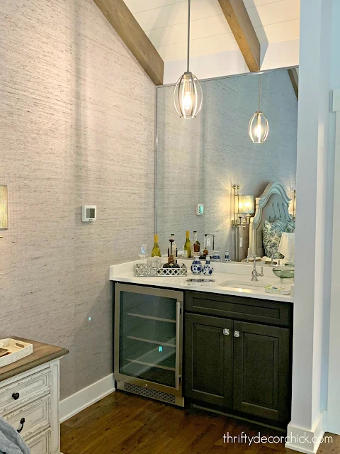
- Gray grasscloth wallpaper in the master -- the whole room had a very romantic feel
- The dark blue/gray cabinets in the basement kitchen. So similar to the Cyberspace color I've used in our home. (Do I dare keep in going in our basement?) ;)
What do you think? What was your favorite space in these two homes? I can't wait to show you my other favorite!
See more of our home here. To shop items in our home, click here! Never miss a post by signing up to get posts via email.


Jealous! Can I just move in?
ReplyDeleteCharmaine Ng | Architecture & Lifestyle Blog
http://charmainenyw.com
Simply gorgeous ! Love that kitchen.
ReplyDeleteFabby
I live for showhouse tours! What beautiful homes...so many pretty details like the wall behind the tub in the first house. Can't wait to see the rest of the houses!
ReplyDeleteShelley
oh my goodness, this home is gorgeous!! Thanks for sharing, major inspiration here!
ReplyDeleteMy daughter and I went on Sunday! We loved house #1, the apartment space in it was so unexpected but we thought it was unique. I wasn't a fan of the second house because I felt that the inside didn't match the outside if you know what I mean?? I loved all the en suite bathrooms but I'm just not a fan of the Jack and Jill ones...too many doors. Thanks for sharing!
ReplyDeleteThere wasn't much I liked on the second house but adored the outdoor/3-season eating area in the first one!
ReplyDeleteIn the last kitchen photo I was intrigued with the the handles on the fridge and dishwasher. So elegant. Also, the details on the cabinet trim made such a difference, a step up from the plain shaker look that would have not been enough in this kitchen. The door knobs and pulls in brushed gold really add some richness overall. I'm on the fence with the bold choice of stone for the counter but admire the bravery of adding it to make an exciting new look. Overall, I think warmth is missing in the show houses these days, maybe it's fabric or more pattern and color in rugs. Not sure. I think they did a good job but a little something is missing for that wow factor. There are a lot of really neat ideas such as the small fridge in the bath vanity, great! The beautiful tile and mesh screening in kitchen 1 photo, the wine glass compartment, tile floor to ceiling etc. but it is like a lot of gimmicky things instead of a cohesive flow and one trend after another. But I loved a lot of all of that and when someone moves in they will add the warm elements that make it a home. I so appreciate your view and comments. It's fun to keep up with what's new and appealing. Black windows are popping up in my neighborhood. I like the steel windows that are almost black but they are so cost prohibitive that it's fun to see how people are getting the look for less. I enjoyed your post about how you did the aluminum clad. We are getting new windows from Marvin and had to stick with white for now since we have so many and they are big windows. It was those simulated divided light with spacer bar grids that threw us into sticker shock! Thank you so much for the fun show house tour! Looking forward to seeing the rest.
ReplyDelete