The elements of elegant, cozy Tuscan style
September 06, 2019
Share this
I've been so excited to share these photos with you! I told you I'd have to break our Tuscan trip into a few posts, and this one is right up my alley.
I've always loved Tuscan style -- but since visiting Napa Valley over the years (that leans heavily this way) and now Italy -- I've fallen in love with it all over again. Back in the day I mimicked the Tuscan look, but then it was a lot of golds, reds and ornate wrought iron. I don't know if the style there has changed over the years, or if that was just our American take on it. ;)
Either way...I have a whole new appreciation for this decor style. I noticed quite a bit of symmetry in the spaces. You know me...symmetry in design makes me crazy happy, so I think that's one of the reasons I was so taken with it.
I'll start with exteriors -- outside the themes are a lot of florals, stone, pottery and GREEN. You can't talk about Italian exteriors without mentioning the doors! I swear every door in every village/town we visited was unique and gorgeous. Solid wood of course...with some detail but not too much.
I shared this entry last week because it's a favorite:
The trend both inside and out was surprisingly simple. Not fussy at all -- the beauty in the sparse finishes make it feel cozy, but elegant at the same time. It just made me feel GOOD.
The interior decor overall was a mix of creamy walls (very little bright white), stone on the floors and ceilings, mixed wood tones (yes, you can), soft accent colors and lots of texture.
Our favorite winery was one of the most beautiful I've ever seen, even their barrel room!:
The color was soft and mixed with wood:
It really is about creating a feeling and experience, and not overdecorating and filling every space. This is what I strive to create in our home as well. (But they seem to do it without even trying!)
I think the decorating trend lately is to fill ALL the empty spots -- and if that's what you love, DO it! But I am learning more of the joy and beauty of simpler spaces.
I hope you enjoyed this post as much as I did! :) Are you a fan of the Tuscan style?
See more of our home here. To shop items in our home, click here! Never miss a post by signing up to get posts via email.
I've always loved Tuscan style -- but since visiting Napa Valley over the years (that leans heavily this way) and now Italy -- I've fallen in love with it all over again. Back in the day I mimicked the Tuscan look, but then it was a lot of golds, reds and ornate wrought iron. I don't know if the style there has changed over the years, or if that was just our American take on it. ;)
Either way...I have a whole new appreciation for this decor style. I noticed quite a bit of symmetry in the spaces. You know me...symmetry in design makes me crazy happy, so I think that's one of the reasons I was so taken with it.
I'll start with exteriors -- outside the themes are a lot of florals, stone, pottery and GREEN. You can't talk about Italian exteriors without mentioning the doors! I swear every door in every village/town we visited was unique and gorgeous. Solid wood of course...with some detail but not too much.
I shared this entry last week because it's a favorite:
It's something that would hard to repeat -- and I think that's the beauty of it. You can't DIY that kind of patina created by time:
Well...you CAN. But it won't look as authentic as this. :)
One of the restaurants in the village where we stayed had the prettiest entry:
The stone pots are repeated often. They stand on their own! Check out that ladder with the herbs in baskets! If our storms wouldn't knock those right off, I'd so do this.
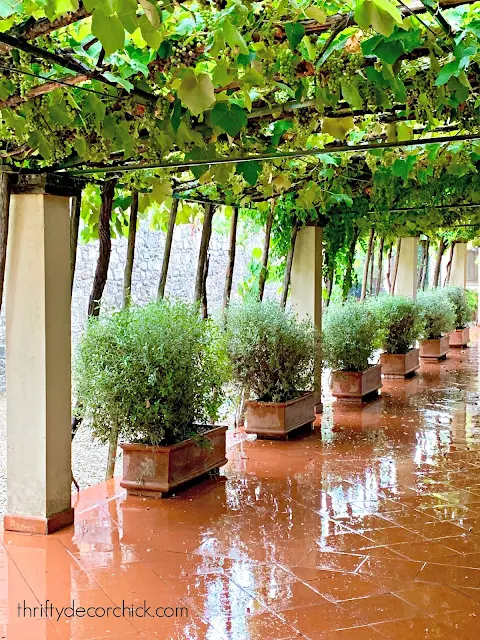
I noticed the planters make a statement -- you don't need a ton of flowers. Simple green plants in stone on repeat make for a beautiful outdoor display:
I gasped when we turned the corner at this winery -- symmetry at it's best!:
The trend both inside and out was surprisingly simple. Not fussy at all -- the beauty in the sparse finishes make it feel cozy, but elegant at the same time. It just made me feel GOOD.
The interior decor overall was a mix of creamy walls (very little bright white), stone on the floors and ceilings, mixed wood tones (yes, you can), soft accent colors and lots of texture.
Our favorite winery was one of the most beautiful I've ever seen, even their barrel room!:
I want those brick floors somewhere. Anywhere!
They had a room with walls covered in wine boxes. It was so simple and stunning. I'm trying to figure out how I can replicate this look:
The Tuscan style is very "fall" feeling to me -- I think that's why I love it so. So warm and cozy but not overly fussy:
Those sconces, right?? I may have to email our contact there and see where they got them. ;) I'm sure they're super affordable. Ha!
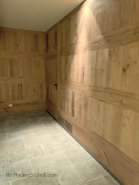
The color was soft and mixed with wood:
Notice the uplighting on top of the cabinet? That's why I love adding lighting to soften spaces. It's such a small detail but makes a big difference.
And the beams! Can we talk about the beams? I just loved them!:
The colors were so soothing -- again, no bright white walls anywhere that I can remember. Do you see the pale gray doors? They make me want to start painting all of the doors in this house.
Even the tile in this bathroom was gorgeous:
This room is in a winery is for wine club members. We walked down the steps into this space and I gasped out loud (again). I was in heaven!:
We visited the duomo in Siena and I'll share more of that later, but the floors in the library were just gorgeous:
One of the restaurants we visited was just a dream. I literally felt like every time I turned around on the trip I was squealing or gasping at the decor or views. 😂
My favorite part was the lighting -- can you see what they did?:
The spot lights shine through the baskets, so the light is diffused. The result was SO lovely!
Can you tell what the back wall is made of?:
Egg crates! I mean, come on!!
We dined at a farm restaurant at the top of a hill one night, and it was so quaint and beautiful. It really struck me how uncomplicated the Tuscan style is:
A wood table, simple linens and black vases with flowers cut from the garden. Add in some candlelight and the look was complete.
It really is about creating a feeling and experience, and not overdecorating and filling every space. This is what I strive to create in our home as well. (But they seem to do it without even trying!)
I think the decorating trend lately is to fill ALL the empty spots -- and if that's what you love, DO it! But I am learning more of the joy and beauty of simpler spaces.
I hope you enjoyed this post as much as I did! :) Are you a fan of the Tuscan style?
See more of our home here. To shop items in our home, click here! Never miss a post by signing up to get posts via email.


Such beautiful pictures! I think that the colors are still there but are natural patinas, like you pointed out with the doors. The rusts occur with the beautiful bricks. Everything seems so natural and textured. Thanks for sharing!
ReplyDeleteThese are such beautiful, inspiring pictures! Looks like something straight out of a resort (now I want to go on holiday!). Thanks for sharing! ❤️✨
ReplyDeleteCharmaine Ng | Architecture & Lifestyle Blog
http://charmainenyw.com
Beautiful photos. I also took lots of photos of doors when I was in Italy. Everywhere you look they are unique & gorgeous.
ReplyDeleteI believe that our American take on Tuscan style was way over the top....not truly genuine. Glad we have moved on to simpler styles now!
Thanks for sharing!
I love that you shared this especially about the lack of bright white.
ReplyDeleteWe live out in the Southwest US and have this nice large 18 inch square tile through out our home and it is this ivory-esqu color. There is just no way no how we can ever re-do it all, but sometimes seeing all the bright white on decorating blogs can get me down. Thanks for showing modern, beautiful, different spaces!
KNatGU