Dramatic Dining Room Makeover With Built in Window Seat
October 30, 2018
Share this
I'm SO HAPPY with the changes I made in this room! Be prepared -- this is a picture heavy post.
First, a little reminder! This is how this dining area started out:
I shared that tour here.
I don't know what to call this room. :) It's not really a separate room -- it's open to our great room. I like to call it a morning room because it looks so pretty in the morning and it's a more relaxed space than a formal dining area. But no one knows what a morning room is (I'm sure it can be many things). 😂 So...I'm sticking with dining room. OK!
Later we purchased a couple pieces of furniture and I was already loving it more:
I always had a plan to add a window seat here. I knew I would want one in this house (like our old house!). I had the builder move the light over 17 inches over instead of directly centered in the room to accommodate for it:
Last I left you, it was trimmed out but I hadn't painted it yet.
I've struggled with a looong wall we have in the room and it's perplexed me since we moved in. I shared my plan for the wall a couple weeks ago -- it included paint and trim.
Well, I painted and we. LOVE. IT:
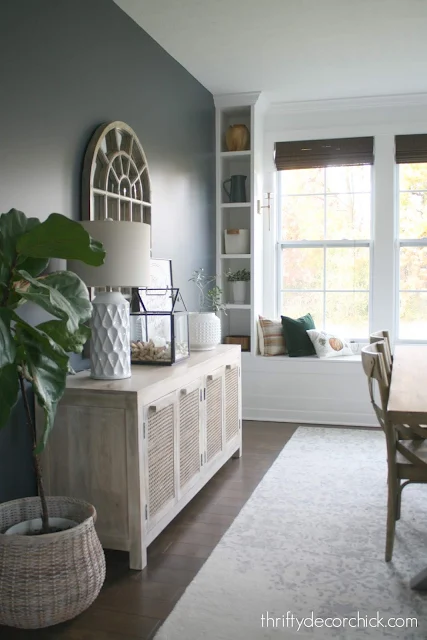
It's the same moody blue (Cyberspace by Sherwin-Williams) that I used in our family room on the fireplace and built ins.
It balances the whole space SO well -- I was so thrilled when I was done!:
The window seat went white...but something was nagging at me. I knew the window wall needed something else. I actually thought of this idea right after the seat was built, but I held off to see how the rest of the room came together.
I realized after everything was painted that the room definitely needed some character...my favorite! Right up my alley. :)
So I got busy building some built ins on either side of the windows. The window seat is about 17 inches deep and I had the wood cut to 14 inches in depth. It was just a personal preference that I didn't want them meet up with the front of the window seat.
I had two 4x8 boards cut down into 14 inch strips and then brought them home to cut them down to the lengths I needed (sides and shelves). Then I had to determine where I wanted my shelves. I used painter's tape on the wall to determine the distance between shelves.
When I figured it out, I used a level to make my measurements and then make a straight line across, where the shelves would go:
For the other side of the built in (I didn't have wood cut for the back -- if you caulk and paint well there's no need for additional wood on the back) I had to make sure the line was at the exact same spot for the shelf:
I simply stacked the two pieces (each side of the built in) and made sure they were lined up exactly. Then I marked where each shelf needed to go.
I have a jig to build without seeing the screws, but if you use the right screws and secure it well to the wall, I just don't find it's needed. I use screws that sink into the wood:
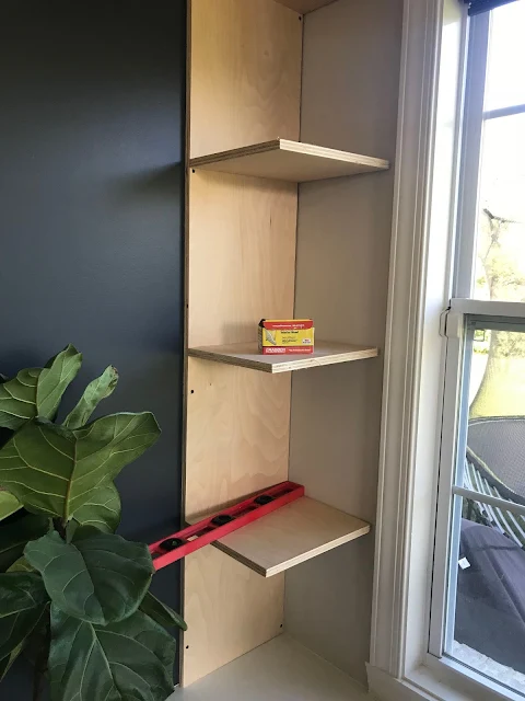
The line gives you a guide for where your shelves will go and where to screw in. You can see the shelf on the other side of the wood.
When I got all the shelves on, I secured this part into the wall:
I did plenty of checking to make sure my other side would fit perfectly between the window trim and the shelves:
When you're doing something like this keep in mind this wood is 3/4 of an inch. So for my shelves I had to deduct 1.5 inches total.
Once that was secure, I added the other side, screwing into the shelves at the lines I marked. As I did it, I check the shelves for level along the way.
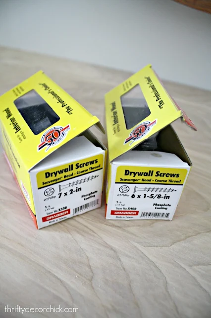
These are my FAVORITE screws for this kind of project:
I got them at Lowe's. They catch easily, drill in well and sink perfectly so you can fill the hole.
I ended up adding a top (that I wrapped with a 1x4 to give a little header) and bottom "shelf" -- they both made it look more finished and built in. I used lattice wood trim to cover all the rough edges and finish it up. I was going to leave it like this to show you on Friday:
Two things were bugging me -- there was a gap at the top because I planned to add crown later on. I have been hiring it out because I just hate doing it myself. (I can do it...I just don't like it.)
And the strip above the window was really bugging me. I thought about adding a "header" of sorts across the top, but man, that was going to be a ton of work that would involve having more wood cut at the store.
So instead, I had an idea. I just painted that part white to match the rest of the built ins and then I went ahead and tried my hand at crown again. Surprisingly, it wasn't hard. At all! I did it!
The key to doing crown is having samples (I have them marked with inside and outside cuts) that you can refer to constantly. This is HUGE! Also, making sure they are at the exact same angle on your saw for every single cut -- I mark my saw with a pencil so I know just where to have them when I cut.
I shared a crown molding tutorial years ago you can check out. Also, there's a much easier way to do it that involves some additional pieces and I shared that cheater crown molding how-to here.
That simple change of painting the strip above the window and adding the crown made ALL the difference! And then after I was done with that, I realized I wanted the smaller wall across the room to be dark blue as well. It was odd having three difference colored walls in this space.
THEN I was done...mostly. ;) I have a couple other things I hope to do and I'll share those in a minute. I'm a little giddy about this room and how it came together:
The whole family loves it! Every day my husband comments on how much he loves it.
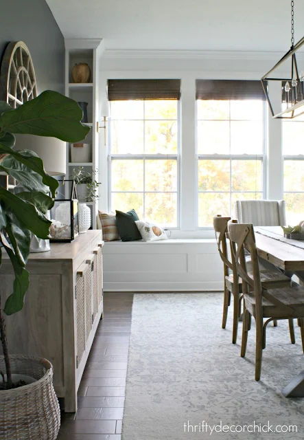
You know a project is good when you step back and feel like the room should have always looked like this...like it's been there forever, but it hasn't!:
At first I planned to do crown around the whole room, but I'm so glad I didn't! Just adding it to this wall makes it really feel like a custom piece. If I decide to add it later it is easy to add it on without removing anything:
My plan was to add flat and wide trim in a grid (square) pattern on this big wall:
But now I'm not sold on it. I think it will get too busy. I'm not completely ruling it out, but I'll wait and see.
The addition of the seat and built ins shrunk the wall just a bit! And I have an idea for each side of the mirror, but I'll probably wait on that as well. It needs to breathe for awhile!:
The window seat has great storage inside and I'm thrilled because I have cushions coming soon! I cannot WAIT to see them on here. I'm already positive they will be the perfect finishing touch:
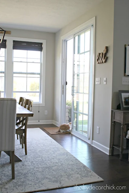
Here's a look at the door wall at the beginning:
And here it is now:
By the way, the walls on the sides of the windows weren't the exact same size. Which kind of burns me up. 😂 But it doesn't matter at all -- don't let that keep you from doing something like this!
Here's this spot with the new furniture earlier this year:
Here is is now!:
Goodness I can't wait to get those cushions on there!
A couple more befores -- that little hallway is getting a makeover next I'm SUPER excited and a little terrified. ;)
I still think the walls need something...and like I said, I have an idea in mind. But I'm going to live with them as is for awhile:
By the way, I loved the before too -- it was lovely. You know I have to add my touches though!:
OH! I almost forgot one of my favorite parts -- the lights on the built ins! I will be sharing all of the details on those later this week. You'll love that project!
I'll go ahead and link to them below:
Here's a list of the items in this room:
- Hanging light
- Wood bistro chairs, World Market
- Upholstered chairs, mirror, lamp, rug, basket -- HomeGoods
- Framed wreath/quote -- my own DIY, made from a towel!
- Buffet and table are from local stores. You can find all the details here.
- Sconces are from Amazon
- Pillows: Green velvet from World Market, others are my DIY from napkins
- Table runner -- World Market
By the way...who needs art when you have this view? So pretty! 😍:
I hope you enjoyed the project. We sure love it. Let me know if you have any questions! I've been sitting here for about four hours now...gotta sign off on this long post! :)
**Edited to add: Check out the new window seat cushion here and how to light those scones without electricity here!
Share this
October 30, 2018
before and after
Bookcases/built ins
decorating
dining room
DIY
painting









This is beautiful! That built-in really is such a gorgeous focal point. And you are right, it does look like it was always there. Thanks for sharing!
ReplyDeleteI already liked the dining room before the makeover, but I think I love it even more after! I could never make a darker colour wall work myself but you do it so flawlessly ❤️
ReplyDeleteCharmaine Ng | Architecture & Lifestyle Blog
http://charmainenyw.com
Dang, woman! You slayed this one! I'm super impressed with how substantial the room looks after all the changes. I'm in the trenches of mothering little kids at the moment and my brain would explode from the kiddo interruptions if I attempted this sort of thing right now... maybe in 10 years! I just love what you've designed here, and I appreciate your imperfectly perfect different width shelf towers. Love the side sconces, looking forward to finding out how you did those. And yes, let the room rest for a bit before deciding about the other wall.
ReplyDeleteLOVE the built-in additions to your room - stunning and welcoming and so substantial and beautiful. Wall colour - wow.
ReplyDeleteJoy
Loved the room before, but this is stunning!
ReplyDeleteSo love it! You are so clever!
ReplyDeleteGorgeous!!
ReplyDeleteIt looks amazing! The built-ins and the window seat look like they were there from the beginning. And, love the darker wall color.
ReplyDeleteWow, this is fantastic! Love it, Sarah. I’m glad the accident is behind you, what a nerve wracking and tiring time that becomes with all the details. Chrissy
ReplyDeleteThank you Chrissy! It was not fun, I'm just glad we were OK!
DeleteYour customizing is amazing and it looks wonderful - even though it was great before. I love the dark paint on the walls rather than trimming it out (which I think would be detracting from the window wall). I do agree that something needs to be changed/added above the sideboard. I'm not a fan of the curved mirror - maybe a large rectangle that carries the eyes from side to side rather than upward, since the eyes already go upward due to your new shelving and crown moulding trim. It's all good. You'll just make it better, I know.
ReplyDeleteI have never commented before and I have been following your blog for about 3 years now. I have to say, this is my absolute favorite thing you have done!!! (Along with your library built ins). You are right in that it looks like it has always been like that. So beautiful! Quick question, how wide is the wall where your bench seat and built in and about how long is your dining room? We are looking at expanding our dining room and I had always envisioned doing a bench seat and built ins like yours. And now I have a inspiration picture to show my builder!!
ReplyDeleteThank you!! The wall is about 12 feet I believe? And the room is about 14 feet long.
DeleteThat view is stunning! It looks like you couldn’t have asked for a better collection of colors. And it’s all RIGHT there! I wouldn’t want to leave the room. And I would catch my breath every time I walked in. You did an amazing job on the built-ins, too. Peace to you as you enjoy your beautiful home and surroundings!
ReplyDeleteOMG I love it! But I love all the projects you have done in the new house (and in your old house as well). Can you just come to my house and do a few things? Just kidding! I want book shelves installed in our family room as it is similar to yours and hubby is like NO but he's not handy like you are and I don't know that I could do it myself. Keep the projects coming!
ReplyDeleteI am IN LOVE with this!!
ReplyDeleteThis is so beautiful! Your skills and style are amazing! I work with wood a lot and I wish I had your courage when it comes to doing things like this! I need to step up my game. I love built-ins and woodworking. I am definitely going to trim out our entrance hall. Hopefully, once I get that done, I will get the courage to do the built-ins I want! You have definitely inspired me to be brave!
ReplyDeleteYay!! I love hearing that! Go for it. :)
DeleteI can't even. You are amazing. This looks absolutely gorgeous!!!
ReplyDeleteI'm in luuuurv. I've been debating a window seat in our front sitting room, as well as almost precisely what you did here for my master BR. Seeing it makes me wanna do it! Got a new miter saw for my bday, but haven't had a chance to use it!
ReplyDeleteShow off!♥️♥️♥️♥️♥️
ReplyDeleteI just love what you did!!!! You are so clever and you have the skills to pull off anything you set your mind to do. I so admire that in you. It is absolutely beautiful!! And i love the color of your walls. I may try that very color in my room. It looks navy in some pictures but in others it's a different color. I really like it. Thanks for sharing what you do to your home on the blog. I love your posts!!
ReplyDeleteOn the wall where your sliding door is...how did you stop the paint at the end of the wall? Does your corner round or is it an agle?
ReplyDeleteIt's a hard corner and I stopped the paint there. :)
DeleteI love it Sarah!! It has the contrast it needed now and the built ins remind me of a modernized Colonial Williamsburg. Adore! Great wiork!
ReplyDeleteWe were rearended Oct 14th and still waiting on the money for our car! It was totaled so bummed about it. Glad y'all are ok. Car accidents stink :-/
ReplyDeleteThis was such a good idea - great execution as well. Congrats!
ReplyDeleteI am stalled out on a built-in bookshelves project because of lack of confidence on how to proceed. This was so helpful! Maybe, maaaybe I'm ready to proceed now.
ReplyDeleteWhat color gray did you use on this wall?
ReplyDeleteI must also say that I love the color of your hardwood!!! Do you know the company and color? Thank you!
ReplyDeleteIt's from Diamond Living flooring but they discontinued this one unfortunately!
Delete