Light or dark? The built in color is...
May 02, 2018
Share this
Hello my friends! Goodness, I forgot how much I loathe painting furniture. Actually, furniture I don't mind so much! There's something about built ins specifically that makes me especially twitchy. I'd rather hang a light fixture than paint all the nooks and crannies -- so you know that's a high level of loathing. ;)
Here's a quick recap for you all, just in case you didn't see what I was up to last week. Our fireplace juts out so we have these spots on either side where I placed these consoles:
I didn't think I wanted to do bookcases because I wanted to keep things simple. That was right after we moved in and I needed to breathe for a bit I guess? But you know me and built ins...we found our way back to each other. ;)
I decided to do a simple build on either side, and I showed you that process last week:
But goodness, we could NOT decide on what color to paint them! We went back and forth over and over. White would look great because it would tie in the fireplace surround. And crisp white is never a bad thing! (Ever.)
But dark would tie in the color I painted the tall fireplace and would offer a some contrast. I finally came to an answer when I did some searching online -- something I always recommend! Most of the time you'll find at least a couple examples of what you have in mind. I searched "gray fireplace with built ins" to see what came up. And my decision was made!
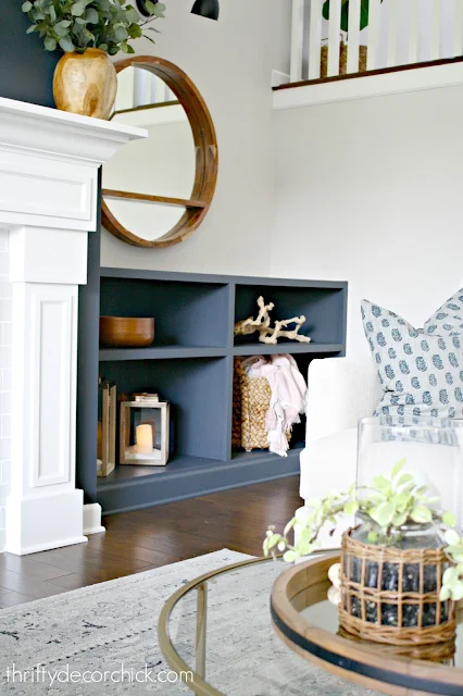
I went with the dark! It's the color Cyberspace that's on the fireplace walls:
I'm keeping the decor super simple and the top will stay empty for now -- I'll know when I see what works! I just don't want it to get too busy.
Funny, because when we first moved in I thought built ins would get too busy, but I think this is so much more calming!:
The dark won out because I knew it would be easier on the eye -- more cohesive than the white would have been. When I looked at pictures of dark fireplaces with white built ins it looked great, but I much preferred the dark on both sides.
It's a slightly more modern feel too -- white would be more traditional. Again, you can't go wrong either way! I also love how the accessories look against the dark blue/gray. I just grabbed some stuff from the basement to fill them, I'm sure they'll change eventually:
Gosh I love that reflection in the mirror! 😍 The candles are fake of course -- and on a timer. 👊
I went with this height because we really love the mirrors there and I wanted to keep them up. But if I ever change my mind I can easily add to them to make them taller:
We've got the speakers there too -- it's best that those aren't enclosed anyway.
I haven't started the other side yet -- that side is a pain in my butt! This set only took me a few hours to build. The other one took double that. Every little thing went wrong! Plus I had to disconnect all the electronics and hook them back up. LOADS of fun.
By the way, that's another big reason I went dark. I'm hoping to hide the cords (SO many cords), but the dark will really help that stuff to disappear. They would have been on display with white built ins. And this room gets a TON of natural light, so it can easily handle the dark color.
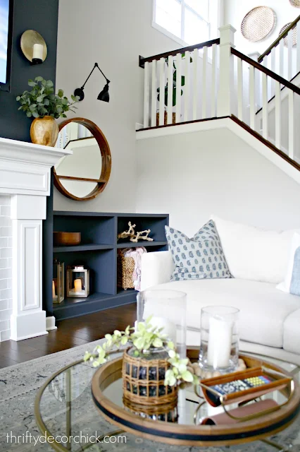
I'll show you the whole thing when I get that side painted and decorated. For now let's just sit over here and enjoy this view!
Side note -- should I paint that small bit of white baseboard on the fireplace walls? It sticks out to me now. Hmmmm...
This room is coming together so beautifully!! I'm so pleased with the built ins, they just take everything to a different level. It looks like they've always been there:
As many of you said, either color would look great but you know me...I loooooove that contrast. Heart eyes! :)
Here's a quick list of the items in this room for you! Let me know if I forgot anything. (Affiliate links included for your convenience!)
- Mirrors -- HomeGoods (But I found this similar one)
- Sofas -- Urban Underpriced in Indy
- Chairs -- World Market
- Round glass table -- Amazon
- Blue pillows -- Pottery Barn
- Stripe pillow -- made with West Elm napkins
- Wood vase -- Target
- Tray on table -- a mirror and I took the hanging hardware off the back :)
- Baskets hanging on wall -- Target
- Round wood art on stairs -- HomeGoods
- Sconces -- Wayfair
If you missed my last post, you can check it out here!


I think the dark colour looks good! You're always a star at making choices. PS. I love the round mirror! 🙂🙂
ReplyDeleteCharmaine Ng | Architecture & Lifestyle Blog
http://charmainenyw.com
I love the shelf that you painted blue, did you build that yourself or bought it somewhere. If bought, where did you get it from?
ReplyDeleteWow! Dark really continues the impact! I love it!
ReplyDeleteI would definitely recommend painting the little bit of baseboard dark, that way its not drawing the eye away from both your fireplace and new built-ins. Paint away!
ReplyDeleteI agree!
DeleteI agree as well - paint it dark, and it will melt away visually. LOVE the Cyberspace color you chose!
DeleteIs there white baseboard on the other side?
DeleteIt looks great! I haven't found a source for the rug in here. Where is that from?
ReplyDeleteThanks!
It’s the vintage abstract from Rugs USA! I always forget about that on my list. :)
DeleteI think the top and middle shelf need some trim on the front to make the eye think that the shelves are made from thicker wood. I think you know what I mean. The area looks so much more complete now and I would have used the dark paint also. The little piece of white baseboard doesn't bother me, but if it does you, by all means paint it.
ReplyDeleteThe whole unit has trim on the front. :) It’s nearly two inches thick.
Deletelove it!! Are you going to put a stained wood top on it? I think that would look awesome, tie into the wood in the mirror really well. I definitely vote for painting that little trim white.
ReplyDeleteYes! I’d like to. I had something in mind but it’s expensive. So I’ll probably just go with regular butcher block. We’ll see. :)
DeleteIt's lovely, Sarah! Great choice to have it blend with the fireplace wall. :-)
ReplyDeleteclap clap clap, Well Done...though I expected nothing less ;) with the built-ins adjacent to and the depth of the fireplace wall the color really belonged to the wall color (I think I voted white) so Way to Go...looks Fab!
ReplyDeleteVery nice, Sarah! When you were searching "gray fireplace with built ins" online did you notice the pics of your family room from your old house sprinkled in among the results? You are inspiring to others!
ReplyDelete