Tall fireplace wall transformation with paint!
April 10, 2018
Share this
Well HELLO! I've been busy. I was trying to remember the last time I picked up a paint roller -- it had to be nearly nine months ago when I finished the bathroom renovation at our old house. It's like riding a bike -- it came right back me! The sore shoulders did as well. 😂
So I told you a few weeks ago about some of my big plans for the house -- I started the bathroom with some peel and stick wallpaper. But I'm a butterfly...I flit from project to project. Sometimes I'm good and have laser focus, but let's be honest, that is rare. It's SO FUN to have a blank canvas again!
I was really itching to get this project done, just because I KNEW it would look so good. It just came down to deciding on a color. I knew I wanted to go with a dark color because I love contrast. I crave it in our home. I quite loved the calm, plain walls for a few months, but I needed that rich color on this fireplace wall:
Here's the inspiration photo I've had saved for years. We looked into expanding our old family room years back and this was our goal for that space:
That didn't happen but I never got that tall, dark and handsome fireplace wall out of my head!
I didn't take any pics of the process because, well. It's boring. I did tape off the fireplace surround and then cover the top of the mantel. I also covered the floor around the fireplace with a tarp.
I knew as soon as I started it was going to look even better than I hoped. It took two coats but those two covered beautifully. As you'll see...I couldn't get to the very top. Well, I could, but heights make me sweat. My hands are sweating right now at the thought of going that high on a ladder, just so you know. I'm hiring out for that part.
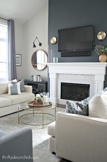
But I couldn't wait to show you because...SO GOOD!! Here's the fireplace wall in it's new lovely, rich, dark gray/blue color I'm now obsessed with:
Let's crop that, shall we? Haha! This photo makes it look like I have it all together:
I'm kind of impressed with how high I got on the front. I used an extension pole and a 10-foot ladder to get that high. I considered getting way up there to cut in...but hand sweat and all.
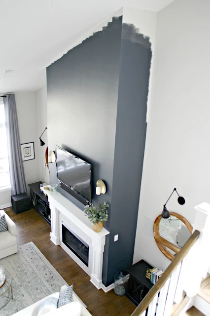
You can see I didn't get all the way up on the sides either:
Again...cropping hides everything:
The color? The color I'm now totally in love with and want all over my house? It's Cyberspace from Sherwin-Williams. It's an absolutely PERFECT dark gray/blue. Sometimes it looks navy, sometimes it's more dark gray. All the time I love it:
I've said it no less than 100 times over the years I'm sure -- the biggest bang for your buck in your home is PAINT. It will transform a room with minimal effort. I don't hate painting -- I find it quite cathartic when I get started. (It's the prep I hate!) But this was more tiring than most because of the height. Still...totally worth it for the big impact!
Two things I love -- the TV and sound bar aren't nearly as in your face as they were before. That's a win in my book. Also, the beautiful fireplace surround and tile really sings now. They are the star. Oh, and three -- the brass accents look crazy good:
I actually picked out the fireplace tile with a dark color like the inspiration pic in mind. I'm so pleased with how the light gray tile works with it! The paint gives great balance to this space -- the dark chairs and the wall work well together.
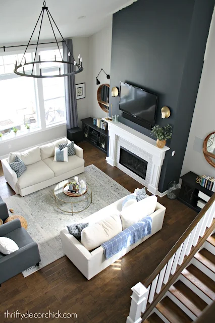
You can see the spots I couldn't get to from these angles:
That right side goes up a few feet, so not happening with this girl. Nope.
The unfinished parts don't bother me as much as I thought they would, just because we're so crazy about the contrast and color. But I've already made some calls. :)
I used a smaller foam roller to get behind the TV. I didn't take it down, there's no need. Does it look perfect behind there? That's a big NO. But will anyone EVER see it? Bigger no.
If you cover that upper part with your hand, it looks pretty good, yes? ;)
I'm also going to add some kind of wall treatment with trim but I haven't nailed down exactly what I want just yet. I thought I had decided but changed my mind. I wanted to go ahead and paint first so we could enjoy it with the darker color.
It's so pretty during the day, but even more lovely at night. When those candles light up and we have the fire lit (plenty lately because it's been so dang cold still...grrrr) it's just SO cozy and lovely! Goodness, I wish I had done this much sooner!
Here's my favorite part -- the before and after! This room is what I first fell in love with in this house, well before drywall:
And here it is now, squiggly lines at the top and all:
I now have big plans for the areas under the mirrors. Stay tuned for that. :)
Again, this color is called Cyberspace and I will be using it again. I have been considering a dark color for the basement kitchenette cabinets (when we do that someday) and I think this may be it. If you're looking for a deep contrast color, it's just lovely.
Have you tried this color? Do you enjoy a dark accent wall like I do
See more of our home here.
To shop items in our home, click here!
Never miss a post by signing up to get posts via email.


It’s looks amazing. Good job!
ReplyDeleteJust LOVE it!! Perfect place for a dark accent wall, and so nice that the fireplace is the star and not the TV. What color did you use on the rest of the wall? It's so subtle and pretty!
ReplyDeleteLove an accent wall whether they are in style or not at the time. Looks so good!
ReplyDeleteIt looks amazing! Love how the TV fades away. Where did you get those gorgeous candle holders?
ReplyDeleteThank you! From Target but I don’t think they sell them anymore. :(
DeleteYes!! We are moving and have a similar set up. I'm wanting to do this to the fireplace but haven't been able to find a picture of it. It looks so good! Yay. Question. Do you have satellite or cable? How did you hide all the wires and the receiver box? We've never had a TV on a fireplace before and I have no idea how we are going to do that.
ReplyDeleteWe have a tv over our fireplace and the cable box is hidden in one of the built in cabinets next to the fireplace. Its kind of a pain to have to have the cabinet door open when we watch tv, but to me its better than all the components being out and visible. I know Sarah did something similar in her old home, but had some sort of metal mesh in the cabinet door, so it wouldn't have to be open.
DeleteYep we have it off to the side! On our other TVs we stick them to the back. Our cable remotes work from anywhere. 👍🏻
DeleteI love how the fireplace looks! It's such a comfortable little corner, fireplaces have always looked so romantic to me! 🙂🙂
ReplyDeleteCharmaine Ng | Architecture & Lifestyle Blog
http://charmainenyw.com
Amazingly gorgeous, Sarah! And that fireplace does, indeed, pop now! My Wee Abode will never get that dark paint, because my LL would never allow that, but I agree that paint makes all the difference. I will be changing up the paint in my home soon, but with a much more subtle effect. AND, I will be using removable wall paper, as well. Have everything for it... just need to find an extra weekend!
ReplyDeleteSO pretty! I love how the fireplace pops now. Love your style!
ReplyDeleteIt's perfect!
ReplyDeleteI love the contrast it really makes that wall a focal point now, where before it blended in. Can I ask where did you source your glass coffee table? I've been looking for a glass round one for my living room.
ReplyDeleteWhen your painter touches up the paint...will that touch-up, not show?
ReplyDeleteNo, with good paint (and stirring before using), that’s never an issue. :)
Deletewow that looks fantastic! It really makes the fireplace pop and the tv blend in, which is awesome! Great job. Which paint color is that?
ReplyDeleteThank you! The main walls are Agreeble Gray. :)
DeleteIt looks great! I agree with others that it provides a stunning focal point, and it better camouflages the television.
ReplyDeleteBeautiful! I absolutely love it.
ReplyDeleteBe right back; going to the paint store to buy paint... :)
ReplyDeleteMy new living room is very similar to yours, but with a 9' ceiling. I painted the entire room Revere Pewter, but knew it was missing something. So glad I saw this! It looks fantastic!
I love a dark accent wall and in your room, it's perfect for the fireplace wall. Funny thing - I didn't even notice your brass candleholders until the wall was painted. I can relate to the height thing. I wouldn't be able to go up there either. My daughter has to finish any painting on my vaulted great room walls. The wall looks amazing and I'm not sure I would do any trim work on it since I love the clean lines, but I'll wait to see what you do and I'll probably change mind. I agree that the areas beside the fireplace need something and I'm sure you'll make it perfect.
ReplyDeleteI love this! It looks so great and it is fun to hear you wish you did it sooner...a reminder to us all regardless of the project!
ReplyDeleteWOW! This is truly a beautiful transformation.
ReplyDeleteSarah - it looks beautiful - the colour is sophisticated and the contrast is stunning. Job well done - you should be proud of yourself! Keep up the great work!
ReplyDeleteThis looks so pretty! I agree that this change really made the tile pop, too! Funny, based on your last home’s fireplace, I was inspired to have our fireplace be dark gray (about to start that project) - that’s actually the project that drew me to your blog and why I started to follow! ☺️
ReplyDeletehttp://fromeasttomidwestcoast.wordpress.com
It looks amazing! The fireplace looks so “substantial” and we can really see it’s lovely details. Sigh...I love your taste.
ReplyDeleteLove the wall! Where can I find your beautiful light fixture? It would look great in my foyer:)
ReplyDeleteWhat a difference! I always look forward to your posts!!! You make it seem easy, but then I look at my living area and go blank! If you are ever in Abilene, Texas...LOL!
ReplyDeleteThat color is absolutely wonderful! I was a little surprised to see that you didn't imitate the inspiration photo with a moulding and color stop at a horizontal line below the vaulted ceiling. We have a corner fireplace that was burgundy brick when we moved in and my eye was forever drawn to the angled line where the dark color met the pale vaulted/angled ceiling. (Thankfully painted out now.) I don't think your house has as many crazy angles going on around the ceiling line as ours does, so maybe the impact isn't as much - in ours we definitely did not need anything else highlighting the angles.
ReplyDeleteI actually love the angle so don’t mind showcasing it. :) It’s a simple space so that helps.
DeleteLooks great! How did you mount your tv? Where do you keep a cable box and/or DVD player?
ReplyDeleteWe had everything wired off to the side when we built. But on our other TVs we Velcro it to the back. 👍🏻
DeleteThis post has given me a great idea for my new (1939) home! I have built in corner cabinets in the dining room and wanted a contrast color and this will be perfect! Thank you!!
ReplyDeleteI LOVE it Sarah!!! It looks so fantastic - and the color is perfection!
ReplyDeleteHi, Sarah! This turned out amazingly! The space looks so finished and "designer" now! It's gorgeous!🙌
ReplyDeleteOf course I don't have to tell you how nice it looks, you know this! But I'll say it anyway. 2 thumbs up, it looks great. Chrissy
ReplyDeleteI actually have the same inspiration photo! Well I have the actual issue of Style at Home magazine that I saved. But it is only a year old (March 2017)? It looks far more navy than grey on the actual magazine cover but the lighting (and editing/printing) probably makes a big difference. I don't want ours to dark since we only have 9 foot ceilings.I wish they had listed a paint colour in the issue!
ReplyDeletehttps://tvastore.com/collections/style-at-home-issues/products/slm-mar17-bi
Thank you so much for sharing your beautiful home with us! I am also obsessed with Cyberspace! I just painted my mudroom cabinets in this color and want it in my family room/kitchen area as well. I stumbled upon your blog and saw this as well as your morning room post. You have inspired me to paint my fireplace wall with Cyberspace in order to bring more of the color into our great room. It's such an intriguing color. I first saw it painted on the doors at a beautiful boutique hotel in Kansas City. I went to the front desk to ask about the color because it was so mesmerizing. They were kind enough to call maintenance and find out what color was used on the doors. Cyberspace! Now, a year later it has become a part of my home as well.
ReplyDeleteLove the look! What is the measurement difference between the mirrors and mantel, and mirrors and sideboard.Thanks!
ReplyDeleteWow... that's beautiful. When we were building our house in 2014 to 16...your inspiration photo was also my inspiration photo. We copied the mantle but on an impulse i painted the wall over the fireplace a deep red, and it's been an eyesore ever since. Your post inspires me to change it to dark navy gray 😊
ReplyDeleteWhat is the wall color? Love the cyberspace!
ReplyDeleteThe rest of the walls are agreeable gray.
DeleteLove your fireplace! What color is the tile?
ReplyDeleteHi. I love this. What colour is the fireplace?
ReplyDeleteCyberspace by SW
Delete