The design plan for my new office
October 04, 2017
Share this
We are counting down the days!! Only about two weeks till we move in to our house and we can hardly even stand it. I am SO ready to be settled again, I cannot even tell you. I've never taken our home for granted but I have a whole new appreciation for a home base. I plan to move in and not leave the house for weeks. :)
I mentioned that many of our friends and family have asked what I'll do now that we're moving into a house that is "done." HA! Same thing I did before...tweak it for years to make it ours. I cannot wait! Even though we got to pick out everything for the house there's plenty we didn't do for cost reasons or because I wanted to live in the house first. And there's plenty I'll do to add my personal touches.
I have a long list, and one of the rooms I'm most excited about is my office. It's going to have a different feel than the craft room/office I created for us in our last house. That one was fun, bright and white. This one will be just for me (the family will use it occasionally) so I want to do something a little different. I've known what I'm doing pretty much from the start, which is rare for me. Usually I have to sit on it for awhile.
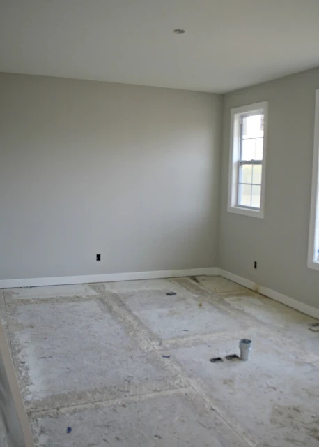
Here's a reminder of the room, this was before flooring went in obviously:
We did carpet in here to save money (and in our master as well) and someday I'd love to put our hardwoods in. But for now I'm digging the comfy feel.
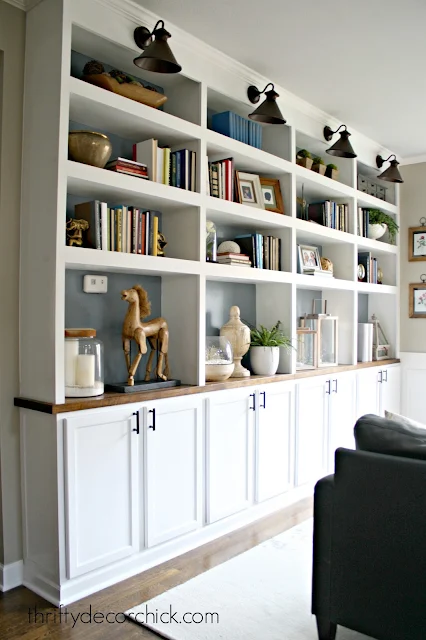
I have three windows in this room -- one small one you can see in the photo and two to the right. The room gets GREAT light. I just love this space. My immediate thought when I walked in here the first time, even without windows and drywall, was it was screaming for these at the back of the room:
Right?? A perfect spot! If you missed my post on those earlier this week you can go here to see more about my DIY bookcases.
I may have to change things up a bit because of that little window -- either the bookcases won't be as deep as they were before and will go just to the window (which is nearly a foot), or I'll build them to sit in the middle of the wall with just a bit of space on either side. (More like a large piece of furniture.)
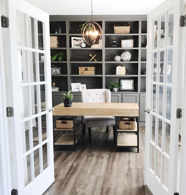
But I have a big change in mind for these -- Merrin happens to live near me and when she showed me their version of our built ins, I was drooling:
One, because it was almost exactly what I envisioned for the layout of this room, and two, because I absolutely LOVE that they painted them gray. It's just moody and pretty and I love it.
I love that I inspired her and in turn she inspired me! So I think that will be the direction of the color.
I showed you the desk last week -- I've always loved this one and I can just see it in my mind in this space:
It will float in the middle of the room under the light. It's nice and long and plenty deep as well. Love that there's a small drawer too. I plan to dress it up a bit with some hardware.
I've had it in my head that I was going to use this beaded chandelier (also from the library in our old house) over my desk, and since we know the buyers of our house we worked it out ahead of time that I'd come take it down (they have one to replace it):
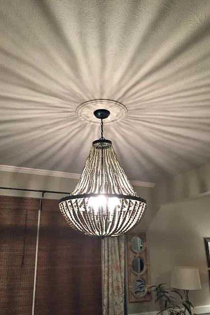
I LOVE the look of it, but bear with me here. Now I can't decide which way to go, because it doesn't let off good light. We put an outlet in the floor so I can plug in a lamp on the desk, but I'd still like a good source of light from the ceiling too.
This is what it looks like when turned on:
I first tried it under the table in our old kitchen and with that weird light on the ceiling it was almost dizzying. I hated it in there (at least at night).
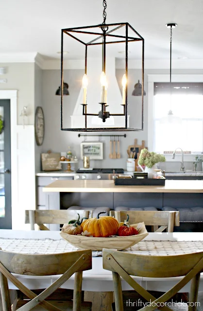
I later put this one up over the table instead, (and they have since replaced it), so now I'm considering this one instead:
It lets off plenty of direct light, which is what I want in the office. I'm just afraid it may be too big in there.
Decisions, decisions! I love both, but the practicality of the metal one may win out.
There's a spot to the right when you walk in the room that is the perfect for this beauty:
I measured for it weeks ago and it is going to be a perfect fit. :) I used this for office supplies in our family room so everything will go right back in the drawers when I unpack.
The wall to the left when you walk in is really long -- I won't put any furniture there but have this art in mind from our old house for that big wall:
The built ins probably won't happen till next year. In fact, I'm going to say they for SURE won't happen till next year. I have promised myself no big DIY projects for the rest of year. The last minute fixes and projects I had to finish up before we moved out of our old house just about did me in, so I need more of a break to focus on the holidays before jumping in to anything new.
But do you see my vision?? Pretty, right? Which light would you choose? Can't wait to be writing to you from this space!
Affiliate links included for your convenience!





Tough decision, but I think I would go for the beaded one. I think it would be great with the desk. We have a light fixture that casts some pretty funky shadows too, so I get that. I'm still trying to figure my own lighting situation out because you definitely need an additional source of light when that's going on.
ReplyDeleteI realllllllly love the gray....Merrin's whole room.
ReplyDeleteI love the gray built-ins... and I like the metal light. I think it may fit-in with the grays you are planning to use, as well, and that dizzy-ing effect... yeah, not sure I would like it at night while working, ya know?
ReplyDeleteLove the direction you are going. Love the gray painted built ins. As far as overhead lighting, while I love the look of the beaded chandy, I think I like the simplicity of the iron one more. I think it will look great over your desk, and also with the gallery wall you are thinking about. Plus the darker color anchors the room.
ReplyDeleteI like the grey builtins! I rarely see darker colours worked that well before and it'd be nice to tackle!
ReplyDeleteCharmaine Ng | Architecture & Lifestyle Blog
http://charmainenyw.com
OHMYGOSH girl this is beautiful. I love that beaded light it's so pretty when it's on!
ReplyDeleteXO Ellen from Ask Away
www.askawayblog.com
I love the beaded light and the shadows it throws on the ceiling - it would look amazing with that desk!
ReplyDeleteBeautiful!! What color of grey paint is on the shelves?
ReplyDeleteI will have to ask her!
DeleteI love the grey build-ins that are in Merrin's room and I like the 2nd light over the beaded light. I don't know if it's my eyes aging or what but I have to have decent overhead lighting and the wonkiness of the light from the beaded one would drive me insane.
ReplyDeleteYour built ins have always been one of my faves. I have a wall that just screams for them in our living room. The problem is that the room currently has carpet - which I cannot wait to replace! We are likely looking at a luxury vinyl plank or engineered hardwood in the future. For that reason I have been hesitant to do this. Sounds like you will need to address this issue as well in this room. How do you plan to solve it? Will you just put in the built ins and run the carpet and later the hardwoods up to it? I am very curious! Or have the entire room carpeted and set the built ins on top or cut the carpet away underneath? I am very curious, because that is pretty much what has kept me from doing this project.
ReplyDeleteGood question! I've built them on carpet many times! When they get torn out you'll need a good razor blade to cut near the built ins, then you'll need to add quarter round or something to cover up any straggly pieces (which you'll most likely do with hard floors anyway). :) If you cut away the carpet first and build on top you'll have to have new tack strips put down and the carpet pulled tight again.
DeleteI wouldn't go with the beaded chandelier. I had to sit under a chandelier once for 2 days using someone else's office. It wasn't exactly like yours, but it gave off a weird effect on the ceiling and walls that is very distracting. Later, the homeowner admitted that they rarely put the overhead light on because of the distracting effect. If you're really working in the office, it would drive you crazy. So, if you want to use a fixture you already have, I'd go with the rectangular one from your kitchen. Could you hang it a little closer to the ceiling, shortening the chain it's hanging from? That might work. It would give you better light.
ReplyDelete