From dark to light: the living room over the years!
October 19, 2017
Share this
OH happy day! We are starting the move in process and I couldn't be happier. I'm pausing the cleaning, packing and unpacking to share another recap from our old house.
Want to know something weird? We don't miss our old house. It's so odd -- we didn't expect that. Even on the days when living in our tiny hotel space was driving me crazy, I didn't miss the house. I desperately wanted to be in our new house, but not the old one. I can chalk that up to two things -- one, we've just been so stinking excited about the new one. Two, we get to visit our old house all the time. :) That's such a blessing for me, I can't even tell you. It feels like it belongs to our friends who bought it (as it should). Such a weird, wonderful thing. :)
So anyway, I've been sharing recaps of many of the rooms in our old house because let's be honest, I don't have much else to talk about lately. 😂 I mean, really. It is what it is. But looking back at the progression of the rooms has always been a favorite of mine, so it's been lots of fun to do this.
I've shared the guest room, family room, kitchen, library/dining room and bathrooms so far. This next one is a room I struggled with for YEARS. We loved the two stories ceilings when we first walked into the model and it's what immediately sold us on the house. Those tall walls were later what made me shake my fists in the air quite often. I never knew how to address them.
I started by hanging stuff really, really high after we moved in:
We're going old school with photos, sorry for the quality. Our two best kitties ever are sitting in the windows. :)
The furniture was all hand me downs. The nesting tables were Bombay Company finds -- remember them? Gosh I loved that store.
We later bought new furniture (that I ended up absolutely HATING). I also went high with a simple painted box on the wall:
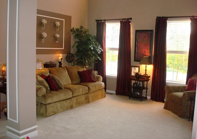
And then...they gold and red phase started. You've seen it before!
I went all out!:
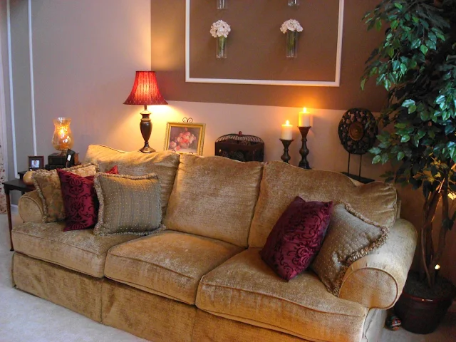
I made a quick sofa table for about $20 that we used for years. It's a super simple build and works great if you want to add some lamps or decor behind your sofa:
I changed up that rectangle a lot huh? My love of molding started and I added even more:
Then I started to branch out from my reds and try some different colors. Part of the reason I went with those colors to begin with was because of the wall color. It's hard to tell in some of the pictures, but in some light our walls looked PINK. As you can see here:
I didn't like other colors with it. It was a taupe color that went really rosy and was a pain in my butt. (And YES, I picked it out, of course!)
We later had half of the house repainted in the analytical gray color it stayed at:
This little corner by the door always felt like it needed something, and I tried a few different pieces:
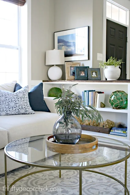
Later on I built a bookcase that extended out from the half wall. I LOVED that little change! It added so much character to the room:
We moved some furniture around and then got a sofa (for a steal!!) for the room and I found that glass table on Amazon. I love that table! I plan to use both of these in the new family room. (I shared my layout options with you here.)
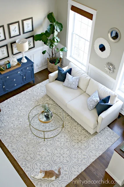
It only took me 13 years, but this space was FINALLY just how I wanted it early this year. And then we decided to move. Ha!:
This was supposed to be more of a "fancy" living area but that's not how we live. We used this room quite often -- every day! It was where our tall Christmas tree stood at Christmas and we made wonderful memories in there. It was such a pretty welcome into our home!
Oh and here's my tip for decorating tall rooms...get ready, it's big. Ignore them. :) I lived with them in quite a few rooms for years and that's how I addressed them after trying all kinds of things. Adding detail, art or any focus up high will accentuate what doesn't need to be accentuated. I think it can absolutely be done well, don't get me wrong. But I've heard from so many of you who struggle with decorating rooms like this and that's always my advice. Keep the decor down instead of going extra high.
You can see more about some of the projects in this space here! If I missed anything feel free to let me know!:
Affiliate links included for your convenience!


I like the "fancy" look of the living room, though! I mean obviously it doesn't look fancy from day to day, but on picture, wow!
ReplyDeleteCharmaine Ng | Architecture & Lifestyle Blog
http://charmainenyw.com
Hi Sara,
ReplyDeleteI am so excited for you and your new house! Thanks for sharing the old photos! It reminded of how my decorating taste has evolved over the years, also! Thankfully, for the better! Good luck!
Ahhhh I loooove transformation pics. How awesome!
ReplyDeleteXO Ellen from Ask Away
www.askawayblog.com
I LOVE seeing your pics from over the years. No need to ever apologize. It shows us how your have grown (both in photography AND style!). It's especially encouraging to those of us just starting blogging. I told my daughter the other day, "I need to just launch, even though I don't understand everything about photography." She said, "I know... I just want your blog to be perfect when it starts." "Well, I love seeing other bloggers' growth over the years. It's encouraging and fun. I want others to experience that with mine, too." She totally understood. I also love that you have kept your dates on your posts. Again, fun to see your history. :-) Have a great weekend!
ReplyDeleteLove the sofa table! I actually made my own (smaller version) a few years ago. My reason though was because m favorite place to sit is the corner of the sectional but there's no where to put a glass, etc. It's worked perfectly!
ReplyDeleteSymmetry even with cats! Haha
ReplyDeleteAlways fun to see the progression over the years. I think of the various phases of home decor in terms of what was in style at the time, so, many people/homes had red, brown, gold, warm phases. That was what was in style at the time.
I like hearing that you're human too, and got your start with hand-me-down furniture. I think it probably makes us appreciate even more what we have later.
Like many of your readers, I'm so excited for you right now!! xo
Chrissy