The Final Guest Room Tour {Through the Years}
August 30, 2017
Share this
A tour of our softened green guest room over the years.
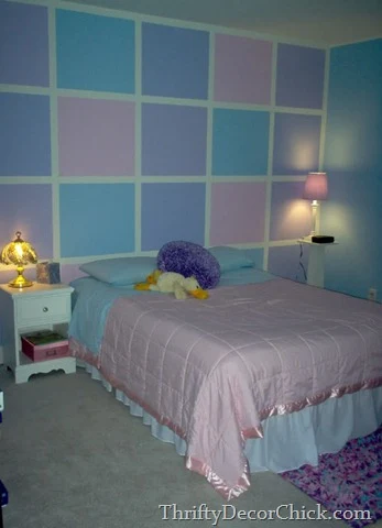
This one was one of the biggest transformations in our house but also one of the least expensive. When we moved in all those years ago, we painted this bright and colorful room for my stepdaughter:
She picked out all of the colors and her and her friends helped me paint the room. I still remember what a fun night that was!
I kind of ignored this room for years after that though -- our guest surely enjoyed sleeping in here. ;) Especially the male guests. I mean, who wouldn't? 😆
But I eventually started tackling this room and it was slow going, like all of my makeovers. The first step? Paint of course -- the easiest way to transform a room, hands down.
First I used the same grid but did an ombre effect with pretty pale greens:
This post may contain affiliate links for your convenience.
I may earn a small commission when you make a purchase through links.
See my policies and disclosure page for more information.
I was working off of the comforter I had found and loved. But I quickly realized those green colors were super hard to work with.
I craved something simpler, so years later I ended up painting the room a different paint color (called Softened Green) that was much more neutral and easy to work with. Loved it!
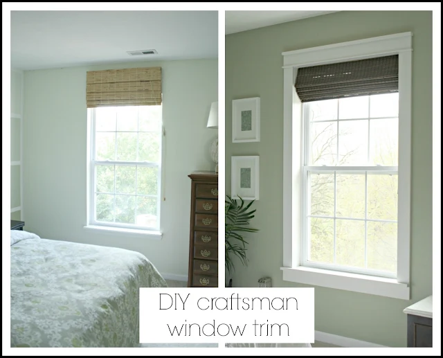
I made some simple updates that made a big difference, like adding my DIY Craftsman window trim around the window:
What a difference, right? It still amazes me what trim does to a room!
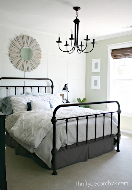
When I painted the room I painted the bed wall the same color and added some simple trim that covered the grid pattern on the walls. You have to be careful when you paint designs on a wall -- usually you'll still see it behind coats of new paint.
So the trim helped to cover that and also looked great:
 |
| See more about that gorgeous metal bed here! |
This trim was $15 -- that's it! LOVE it.
I eventually painted that back wall white, because I just love any wall with molding to be in white. It really brightened up the room.
We didn't have overhead lights run when we built the house so one was added -- the light made a big difference in here as well.
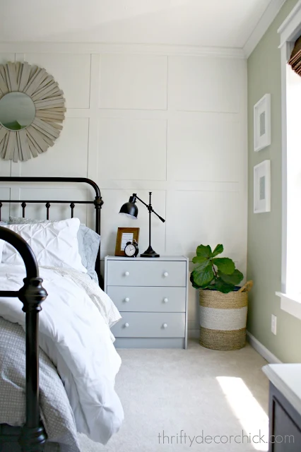
I later updated some inexpensive Ikea dressers with paint and used them as nightstands:
The hardware is my favorite part -- I used paper napkins and glue to decorate those.
This is how the room looked before we moved:
It was a small room (the guest in the new house is as well) but functioned well for our guests. I LOVED this sweet room. It was so cozy, but also one of the brightest rooms upstairs.
 |
| See how to make that DIY sunburst mirror here. |
I moved the big dresser up here and loved the black with white knobs in this pretty space:
The whole room was just that...pretty and practical. I think it was an oasis for our friends and family who stayed in our home and that makes me happy.
I tried to add touches that would make them feel at home -- like easy access to our wifi code:
As well as lots of blankets at their disposal and plenty of magazines for reading material:
Overall I was thrilled with how this room came together over the years, and I did it with a small budget:
I hope to recreate much of it in our new home, but I may go with a different wall color. More on that later! I love looking back to see how far the rooms in our house came. If I missed anything below let me know!
Here's a resource list for the room:
Duvet cover -- Bed Bath and Beyond (clearance)
Chandelier -- Lowe's
Black dresser, vintage
Never miss a post by signing up to get posts via email.
Share this
August 30, 2017
before and after
Board and batten
decorating
guest room
Guest Room (previous)
molding


You did wonders with every room in your old house. Your friends who bought your house must feel like the luckiest people on the planet.
ReplyDeleteLove seeing the transformation of this room! I just adore how that white trim looks with the bed frame and those knobs on the dresser are super cool! :)
ReplyDeleteSuch a pretty guest room, no doubt your guests were thrilled!!
ReplyDeleteI have followed your blog since 2011 and love every bit of it! I look forward to seeing your new homes creations!
ReplyDeleteI have a vey off the wall question...an ad for LensCrafters pops up right over your posted photos with out being able to click it off. SO Annoying. I just wondered if you know how I can disable that?
I love the ideas for this guest bedroom. I would never have thought of the little touches, such as the frame including the wifi password, or having reading material available. Awesome and creative ideas!
ReplyDelete