Everything You Ever Needed to Know
March 24, 2015
Share this
Seriously, what did we do before the internet? I know -- played outside a lot more, got more exercise, actually talked to each other, whatever. But how did we find out the real important stuff like what size rug to buy? HOW??
Thankfully we now have access to that information and better yet, brilliant people create infographics that allow us to figure it all out in one glance. Thank YOU internet and those people. (And I remember back in my old PR days when Internet was always capitalized. Old.)
So over the weekend when I was making the new bed pillows, I searched to find ideas for the placement of the pillows. I’ve never been good at the bed making thing – you know this. I ended up doing a mix of a couple of these but I did find this very helpful:

I did the Belgrave. :)
When I do a gallery wall I literally just start placing things and moving them around till I like the way it works. Yes I end up with a few holes to fill. If you need more structure to this process then this one is helpful:
Awesome ideas!
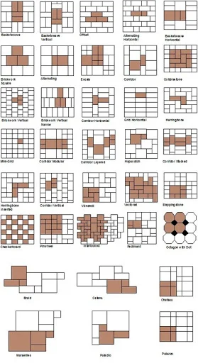
I’m hoping to take on a few tiling projects this year and I found this tile design infographic fascinating:

Some of those scare me a little and I think are best left to the professionals. But some are very doable.
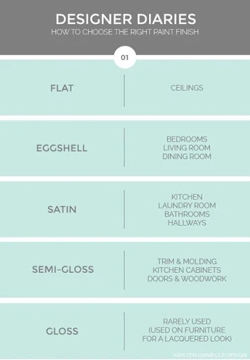
I get asked about paint sheens a lot – this is a simple explanation of how and where to use each one:

I’ve used gloss on trim in the past but have moved to semi-gloss instead over the past few years. We made the mistake of allowing our builder to paint half of our house in flat paint – worst idea ever. I do not recommend flat paint high traffic areas ever – you can’t wipe it down. There are newer formulas that are supposed to be a little better, but I’d still stick with eggshell. Remember, the higher the gloss the more imperfections will be seen.
This one is brilliant – it compares all the various flooring types based on cost, durability and ease of installation and cleaning:
Love it!
Another hard one – choosing the right rug size for your space. This one gets a lot of us, right? This graphic from World Market is helpful:

And here’s a do and don’t version:

Before the internet we obviously lived all willy nilly with pillows and rugs all over the place. Thank goodness for infographics. ;)
Again, you know what I say – it’s your house. Do what you want. I believe there are no rules when it comes to your own home and you should do what you love. But these do help those of us who need a little direction sometimes!
Have you found any of these helped you out?
Thankfully we now have access to that information and better yet, brilliant people create infographics that allow us to figure it all out in one glance. Thank YOU internet and those people. (And I remember back in my old PR days when Internet was always capitalized. Old.)
So over the weekend when I was making the new bed pillows, I searched to find ideas for the placement of the pillows. I’ve never been good at the bed making thing – you know this. I ended up doing a mix of a couple of these but I did find this very helpful:
This one is helpful when actually making a “proper” bed – again, I say do whatever the heck you want with your bed and your house. But I’m nearly 40 so I figured it was about time to figure this out:  Just Decorate
I showed you this one when I made our tufted headboard – these are the different headboard designs:  Just Decorate
I did the Belgrave. :)
When I do a gallery wall I literally just start placing things and moving them around till I like the way it works. Yes I end up with a few holes to fill. If you need more structure to this process then this one is helpful:
Awesome ideas!
I’m hoping to take on a few tiling projects this year and I found this tile design infographic fascinating:

Some of those scare me a little and I think are best left to the professionals. But some are very doable.
I get asked about paint sheens a lot – this is a simple explanation of how and where to use each one:

I’ve used gloss on trim in the past but have moved to semi-gloss instead over the past few years. We made the mistake of allowing our builder to paint half of our house in flat paint – worst idea ever. I do not recommend flat paint high traffic areas ever – you can’t wipe it down. There are newer formulas that are supposed to be a little better, but I’d still stick with eggshell. Remember, the higher the gloss the more imperfections will be seen.
This one is brilliant – it compares all the various flooring types based on cost, durability and ease of installation and cleaning:
Love it!
Another hard one – choosing the right rug size for your space. This one gets a lot of us, right? This graphic from World Market is helpful:

And here’s a do and don’t version:

Before the internet we obviously lived all willy nilly with pillows and rugs all over the place. Thank goodness for infographics. ;)
Again, you know what I say – it’s your house. Do what you want. I believe there are no rules when it comes to your own home and you should do what you love. But these do help those of us who need a little direction sometimes!
Have you found any of these helped you out?
I shared a bunch of other tips like light fixtures sizes and heights here!


Don't call yourself too old --- Internet is still always capped in AP style, Chicago style and most dictionaries!
ReplyDeleteWho knew there were so many rules to design and placement? The internet is making us all design experts! (or so I'd like to think). Thanks for sharing some of these! The tile design infographic in particular is definitely one to save!
ReplyDeleteLoooooonnng time reader... first time commenting. THANK YOU (!!!) for posting this! It's so helpful!
ReplyDeleteThis is a great post! Love the graphics and I can now organise every little aspect of my home :)
ReplyDeleteLeah @ The Shelf Society
I love this post the most!!!! Thanks so much for sharing. Love "technically knowing" all this stuff. :)
ReplyDeleteI have some of these and others that I truly need!Thanks Sarah! Great round-up!
ReplyDeleteWOW!!! What a wealth of information....my head is spinning. I agree, what did we actually do before the internet. Thanks so much for these ideas, information and things not to do.....very helpful.
ReplyDeleteThe graphic for making the proper bed is such a great tip!
ReplyDeletexoxo, SS
The Southern Stylista
Kind of like the pillow placements and will try a few of them but only because my hubby is a little anal and everything has to be just so...this will totally mess him up! LOL Thanks
ReplyDeleteWow, this is so awesome! Now, if I could only figure out the correct size of chandelier to hang..... oh wait, there's the internet!
ReplyDeleteI have used the bed making and carpet tips...definitely helped me make things look better! However I really agree with you statement of 'it's your house, do what you want' I keep seeing curtain hanging advice that I really don't agree with! The whole hang curtains just under the ceiling and outside the molding to make windows look larger is something I just don't like...mostly because a lot of the time it makes a small room look smaller and shorter. That is one trick that needs to take the whole room into account and often people don't! So I love when you encourage readers to do what they want...personal taste lasts longer than trendy rules!
ReplyDeleteI knowingly broke a paint rule and it worked out great lol. I knew the color I used in my great room would have a more authentic look in a flat finish. There's just a certain dimension you get using it that works great with certain paint colors and room styles. It's also great if you know you will be touching up the paint constantly regardless of finish because it leaves no brush strokes behind.
ReplyDeleteGreat tips. I need these :)
ReplyDeleteGreat cheat sheets...thanks for putting it all together.
ReplyDeleteHuh - I totally prefer flat paint and have it in most of my house. Kids running around, too. Haven't had a problem wiping :) It's YOLO which is supposed to be more durable, so maybe that's it.
ReplyDelete