Simplifying the library shelves
July 17, 2017
Share this
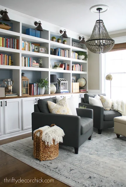
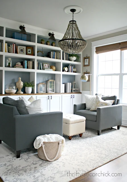
Hello hello! Welcome to a new week! I'm sharing some small updates I've made to our dining room turned library built ins over the past few months. You may remember this room and how we transformed it from a rarely used dining room to this cozy space:
So when I get things the way I like them they rarely move...for years. For real, a bookshelf will look the same for five years (many of our surfaces have!) if I find a way I like them. Accessorizing kinda stresses me out so I don't mess with it often. :)
But here it was feeling a little heavy to me, so late last year and then one the past few months I've started changing out a few things and simplifying a bit. Most of it was editing -- I usually find taking away usually makes more of an impact than adding. I removed some of the brighter books for a more soothing look. It really made a big difference! I kept a few because I'm not going to be the crazy red book lady, but removing some of them toned it down a bit.
Then I paired down the items on the shelves a little and changed the direction of some things:
Those lower shelves were feeling cramped to me before, so as you can see I changed out some of the pieces with bigger but simpler items. The wood horse I found at an antique shop -- it's not antique but it looks like it! All the parts of the legs move and I just think it's the coolest.
I went with a lot of wood tones there to calm those spots a little:
They tie in beautifully with the wood beads on the chandelier:
I purchased a few pieces for the shelves awhile back -- I think most were from Target. Those wood and glass candle holders are so pretty -- I showed you how I use those at Christmas with the LED lights here. And the wood and glass terrarium was from Target too. I think the wood finial was from At Home? I had the rest of the stuff and moved it to those shelves.
By the way, I got those chairs on sale at World Market years ago and still love them. They are super comfy -- they look more charcoal online but are more of a blue gray.
I just love how it's calmed a bit -- I always say giving your space room to breathe makes a BIG difference!! Isn't that horse the coolest?:
I wrote a whole post on how to decorate bookcases here -- I think they are the hardest to accessorize! What do you find hardest to decorate? Bookcases? Dressers? Coffee tables? I struggle with them all -- and once I find what works it rarely changes. ;)
You can see how I built those built ins with kitchen cabinets here and see the transformation of the room over the years here!
Affiliate links included for your convenience!


Looks awesome! Gray is my favorite color. We took a big leap a few years ago and painted our walls on the entry level charcoal gray. I about had a heart attack at first but soon after I fell in love with it and still do!
ReplyDeleteLooks great as always. I found some of the mini lights recently at Kohls. I noticed you changed the rug. It's very pretty. Is it a Homegoods find?
ReplyDeleteI think so! I switched this rug from another room but I'm pretty sure I got that from HG. :)
DeleteThey are beautiful! My bookshelves will never be beautiful. I'm a librarian and addicted to books and have bookshelves in every room stuffed with books that we read. Some of them over and over and over. I met my husband in a book club. Our child is obsessed with reading. And every time I try to get rid of a book they freak out. Unless I'm replacing it with a new "beloved" book.
ReplyDeleteSo I love to look at beautiful pictures of gorgeous bookshelves and drool a little while recognizing that will never happen in my house. Thanks for letting me get that off my chest. ;-)
Your bookshelves look great. Can't believe accessorizing stresses you out. You do such a great job. I thought I was the only one that got stressed out on accessorizing. Also, love the horse you found. Super cool.
ReplyDeleteI hate to accessorize also. I'm good at furniture placement, hanging artwork, coordinating colors, creating a homey feel, etc. But "decorating" a tabletop or bookshelves (other than with books I hate to get rid of) or a bedroom dresser top (the hardest for me since my bedroom seems to collect dust and dog hair like magic). My solution is that less is more and only my most-loved things are on display.
ReplyDeleteThis could not be a more perfectly timed post.. we are in the middle of building out own shelves based on yours and I'm getting anxious about filling them up! Thank you for all of your inspiration!!
ReplyDeleteWow, the bookshelves look amazing and very calming. Did you paint the back wall of them a different color than the walls? It's kind of hard to tell from the photos. If you did I think it's brilliant!
ReplyDeleteYes! It's a blue gray color -- I think I have it listed under our paint colors on projects tab above. It's something like Storm Cloud I think?
DeleteThe horse is amazing-great find. You may re-think the paring down a little bit, I find it rather "model home" like. It is what you're calling a library, can a library have too many books?
ReplyDeleteI respectfully disagree. :) These are most of our books. My husband has more of his in his office for his needs as well.
DeleteNo wonder I haven't seen your posts lately - they haven't been showing up on my Bloglovin' feed. But now they're back and I get three doses of your makeovers at once. Amazing space as always!
ReplyDeleteCharmaine Ng | Architecture & Lifestyle Blog
http://charmainenyw.com